The Roble is an insurance company known for its personalized and human services that accompany consumers through every stage of their lives.
Services
Branding: Logo Design, Concept, Brand Strategy, Consumer Research
Client
The Roble Insurance
Year
2024
Get this service

Challenge
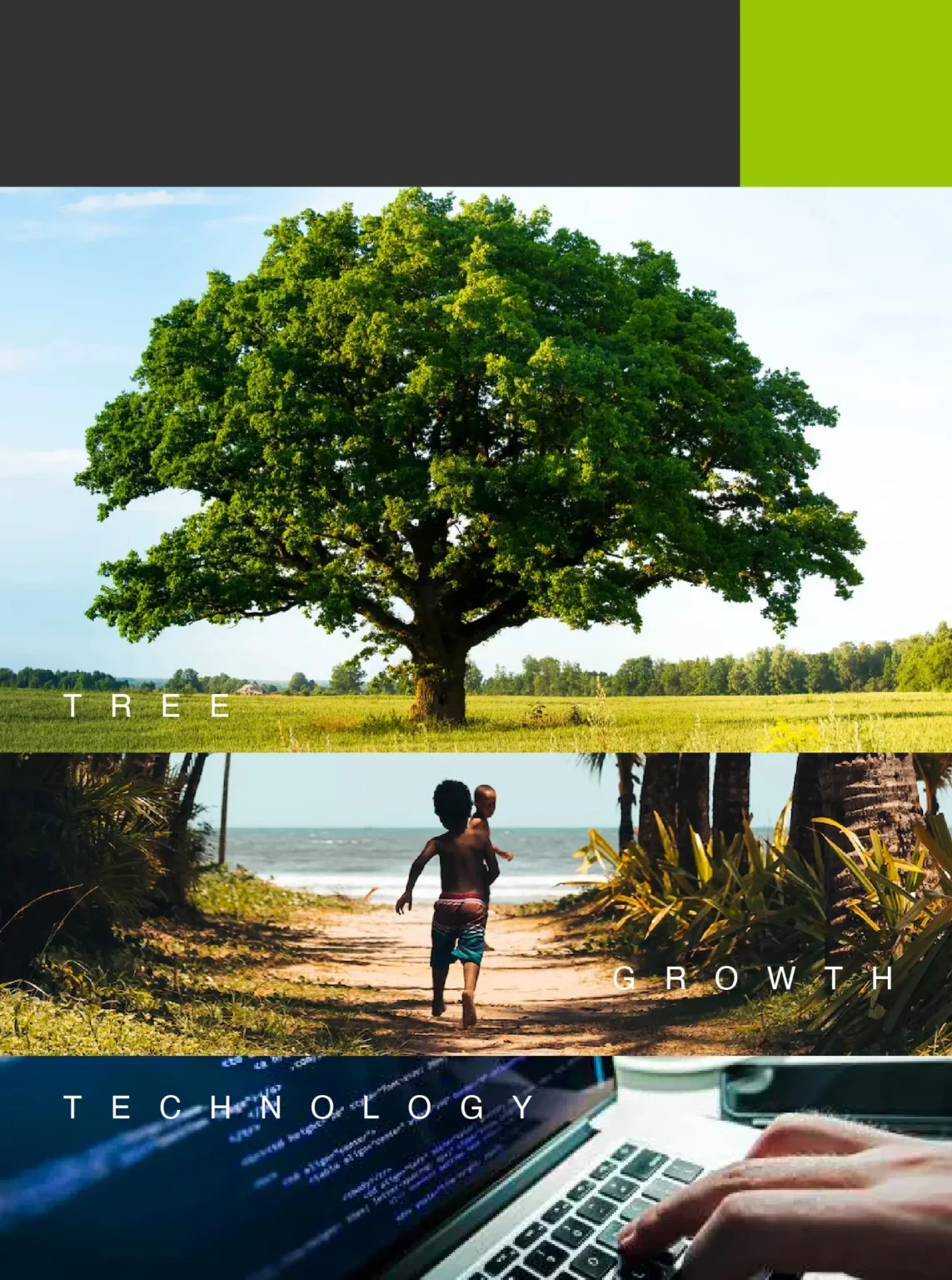
The oak tree, a robust and majestic species, stands approximately 131 feet tall with a wide crown at the top.
Our challenge was to represent the brand by drawing inspiration from this tree, integrating it into a traditional and complex business concept for the consumer to understand.

Goal
After extensive research and understanding the company's vision for digital transformation.
We realized the opportunity lay in the brand’s close connection with the consumer, timely and clear access to information, and representation of protection.
Result
This led to a graphic representation that combines technological and natural elements through the analogy between the asterisk and the tree. We used a minimalist and modern typography, coupled with subtle elegance in text bodies, and blended the seriousness of gray tones with the modernity of bright green.
By incorporating these elements, we aimed to reflect the strength, reliability, and growth symbolized by the oak tree, while making the brand approachable and relevant in the digital age.


